# Creating a new WYSIWYG field in the admin panel
In this guide we will see how you can create a new field for the admin panel.
For this example, we will replace the default WYSIWYG with CKEditor (opens new window) in the Content Manager by creating a new plugin that will add a new field in your application.
# Setting up the plugin
Create a new project:
Generate a plugin:
Enable the plugin by adding it to the plugins configurations file:
// path: ./config/plugins.js

module.exports = {
  // ...
  'wysiwyg': {
    enabled: true,
    resolve: './src/plugins/wysiwyg' // path to plugin folder
  },
  // ...
}
Install the required dependencies:
Start the application with the front-end development mode:
✏️ NOTE
Launching the Strapi server in watch mode without creating a user account first will open localhost:1337 with a JSON format error. Creating a user on localhost:8081 prevents this alert.
We now need to create our new WYSIWYG, which will replace the default one in the Content Manager.
# Creating the WYSIWYG
In this part we will create 3 components:
- a
MediaLibcomponent used to insert media in the editor - an
Editorcomponent that uses CKEditor (opens new window) as the WYSIWYG editor - a
Wysiwygcomponent to wrap the CKEditor
The following code examples can be used to implement the logic for the 3 components:
Example of a MediaLib component used to insert media in the editor:
// path: ./src/plugins/wysiwyg/admin/src/components/MediaLib/index.js

import React from 'react';
import { prefixFileUrlWithBackendUrl, useLibrary } from '@strapi/helper-plugin';
import PropTypes from 'prop-types';

const MediaLib = ({ isOpen, onChange, onToggle }) => {
  const { components } = useLibrary();
  const MediaLibraryDialog = components['media-library'];

  const handleSelectAssets = files => {
    const formattedFiles = files.map(f => ({
      alt: f.alternativeText || f.name,
      url: prefixFileUrlWithBackendUrl(f.url),
      mime: f.mime,
    }));

    onChange(formattedFiles);
  };

  if(!isOpen) {
    return null
  };

  return(
    <MediaLibraryDialog onClose={onToggle} onSelectAssets={handleSelectAssets} />
  );
};

MediaLib.defaultProps = {
  isOpen: false,
  onChange: () => {},
  onToggle: () => {},
};

MediaLib.propTypes = {
  isOpen: PropTypes.bool,
  onChange: PropTypes.func,
  onToggle: PropTypes.func,
};

export default MediaLib;
Example of an Editor component using CKEditor as the WYSIWYG editor:
// path: ./src/plugins/wysiwyg/admin/src/components/Editor/index.js

import React from 'react';
import PropTypes from 'prop-types';
import styled from 'styled-components';
import { CKEditor } from '@ckeditor/ckeditor5-react';
import ClassicEditor from '@ckeditor/ckeditor5-build-classic';
import { Box } from '@strapi/design-system/Box';

const Wrapper = styled(Box)`
  .ck-editor__main {
    min-height: ${200 / 16}em;
    > div {
      min-height: ${200 / 16}em;
    }
    // Since Strapi resets css styles, it can be configured here (h2, h3, strong, i, ...)
  }
`;

const configuration = {
  toolbar: [
    'heading',
    '|',
    'bold',
    'italic',
    'link',
    'bulletedList',
    'numberedList',
    '|',
    'indent',
    'outdent',
    '|',
    'blockQuote',
    'insertTable',
    'mediaEmbed',
    'undo',
    'redo',
  ],
};

const Editor = ({ onChange, name, value, disabled }) => {
  return (
    <Wrapper>
      <CKEditor
        editor={ClassicEditor}
        disabled={disabled}
        config={configuration}
        data={value || ''}
        onReady={editor => editor.setData(value || '')}
        onChange={(event, editor) => {
          const data = editor.getData();
          onChange({ target: { name, value: data } });
        }}
      />
    </Wrapper>
  );
};

Editor.defaultProps = {
  value: '',
  disabled: false
};

Editor.propTypes = {
  onChange: PropTypes.func.isRequired,
  name: PropTypes.string.isRequired,
  value: PropTypes.string,
  disabled: PropTypes.bool
};

export default Editor;
Example of a Wysiwyg component wrapping CKEditor:
// path: ./src/plugins/wysiwyg/admin/src/components/Wysiwyg/index.js

import React, { useState } from 'react';
import PropTypes from 'prop-types';
import { Stack } from '@strapi/design-system/Stack';
import { Box } from '@strapi/design-system/Box';
import { Button } from '@strapi/design-system/Button';
import { Typography } from '@strapi/design-system/Typography';
import Landscape from '@strapi/icons/Landscape';
import MediaLib from '../MediaLib';
import Editor from '../Editor';
import { useIntl } from 'react-intl';

const Wysiwyg = ({ name, onChange, value, intlLabel, disabled, error, description, required }) => {
  const { formatMessage } = useIntl();
  const [mediaLibVisible, setMediaLibVisible] = useState(false);

  const handleToggleMediaLib = () => setMediaLibVisible(prev => !prev);

  const handleChangeAssets = assets => {
    let newValue = value ? value : '';

    assets.map(asset => {
      if (asset.mime.includes('image')) {
        const imgTag = `<p><img src="${asset.url}" alt="${asset.alt}"></img></p>`;

        newValue = `${newValue}${imgTag}`
      }

      // Handle videos and other type of files by adding some code
    });

    onChange({ target: { name, value: newValue } });
    handleToggleMediaLib();
  };

  return (
    <>
      <Stack size={1}>
        <Box>
          <Typography variant="pi" fontWeight="bold">
            {formatMessage(intlLabel)}
          </Typography>
          {required &&
            <Typography variant="pi" fontWeight="bold" textColor="danger600">*</Typography>
          }
        </Box>
        <Button startIcon={<Landscape />} variant='secondary' fullWidth onClick={handleToggleMediaLib}>Media library</Button>
        <Editor
          disabled={disabled}
          name={name}
          onChange={onChange}
          value={value}
        />
        {error &&
          <Typography variant="pi" textColor="danger600">
            {formatMessage({ id: error, defaultMessage: error })}
          </Typography>
        }
        {description &&
          <Typography variant="pi">
            {formatMessage(description)}
          </Typography>
        }
      </Stack>
      <MediaLib
        isOpen={mediaLibVisible}
        onChange={handleChangeAssets}
        onToggle={handleToggleMediaLib}
      />
    </>
  );
};

Wysiwyg.defaultProps = {
  description: '',
  disabled: false,
  error: undefined,
  intlLabel: '',
  required: false,
  value: '',
};

Wysiwyg.propTypes = {
  description: PropTypes.shape({
    id: PropTypes.string,
    defaultMessage: PropTypes.string,
  }),
  disabled: PropTypes.bool,
  error: PropTypes.string,
  intlLabel: PropTypes.shape({
    id: PropTypes.string,
    defaultMessage: PropTypes.string,
  }),
  name: PropTypes.string.isRequired,
  onChange: PropTypes.func.isRequired,
  required: PropTypes.bool,
  value: PropTypes.string,
};

export default Wysiwyg;
# Registering the field
The last step is to register the wysiwyg field with the Wysiwyg component using addFields(). Replace the content of the admin/src/index.js field of the plugin with the following code:
// path: ./src/plugins/wysiwyg/admin/src/index.js

import pluginPkg from "../../package.json";
import Wysiwyg from "./components/Wysiwyg";
import pluginId from "./pluginId";

const name = pluginPkg.strapi.name;

export default {
  register(app) {
    app.addFields({ type: 'wysiwyg', Component: Wysiwyg });

    app.registerPlugin({
      id: pluginId,
      isReady: true,
      name,
    });
  },
  bootstrap() {},
};
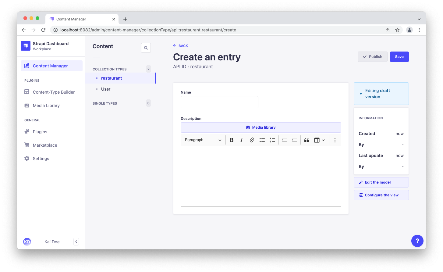
And voilà, if you create a new collection type or single type with a rich text field you will see the implementation of CKEditor (opens new window) instead of the default WYSIWYG: